Location list - my location list is in my house mainly which is out of the way of anything bad going to happen as i have only filmed 'Rachel' on the bed and 'Rachel and carley' in the corner.
One of the shots is on a path of a busy road, we thought that it would destract drivers and therefore moved the location to 'Snuff mill' which is a big field that stands on its own. ( only dog walkers around.)
Friday, 29 January 2010
Wednesday, 27 January 2010
The amityville horror
 (Although the modern poster says dvd it is still what is on the
poster.)
 I prefer the old poster to the new one because it has a scary effect. the fact that the image is dingy and has disorientated surroundings makes the viewers want to watch it. The red writing also stands out and makes the audience concentrate on the man with a pair of sheers.
Texas chainsaw massacre


The texas chainsaw massacre posters, The old poster has alot of writing on it and i think that the more modern film posters are mainly about image and what the audience can get from a photograph.
I like the texas chainsaw massacre new poster because the head of the man is disorientated yet evil which immediatley tells us that something bad is going to happen in the film because the antagonist has an murdorous look about him.
Friday, 15 January 2010
The last house on the left


Here is two film posters from the film 'The last house on the left'. the first one is the original film and poster to come out. (1972)
For my poster i am comparing these to posters to see the conventions and to see which is more effective on the audience.
The modern poster for the last house on the left shows the audience the cast and the house in which it takes place. i like the contrast of the red and white against the black and may well use this effect.
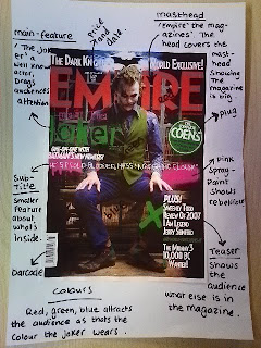
Analyse magazine - 'Empire'


The magazine i have analysed is 'Empire'. i like this magazine because it is iconographic of 'Batman'. I think that this is a really good technique to sell to the audience which i think i might use because when people see the batman logo they immediatley think 'Batman' so i may make a logo. Other things i like would be where the barcode is, it is completely out of the way of the subtitles and teasers which i find affective because it is less important. The spray painted title in the middle of the screen is also very effective in the sencse that it reflects the jokers rebellious side. it reads 'He's a cold blooded mass murdering clown'.
Analysed magazine - 'Total film'


This magazine i have analysed is 'Total film'. I think that this magazine drags readers attention through the text more than the colours, whih breaks the rules a little. The things on this magazine that i would use would be the main title. i like how the heads of the actors are over the text and how the total is inside the 'F'. Aswell as this i also like the teasers being at the left hand side it makes the magazine look more formal and less packed!
Analysed magazine - 'Hotdog'


To look at the codes and conventions of film magazines i have analysed the film magazine 'Hotdog'.
This magazine has lots of features that are designed for the purpose of dragging audience attention in. ( Which makes sales) The things that stand out to me the most that i would like to use would be The fonts of the lettering, they are of medium size however, they stand out well against a coulourful background. The teasers are really interesting aswell as they drop actors and actresses names this shows the audience who is inside the magazine but dosn't tell to much. hence the name 'Teaser'.
The layout for my film magazine
Subscribe to:
Comments (Atom)
